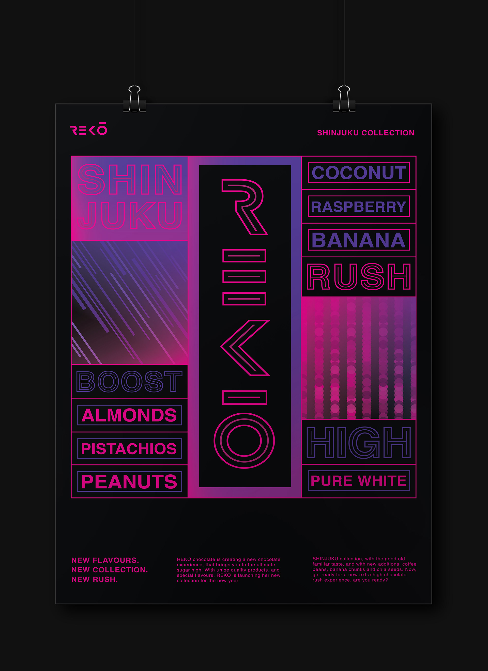
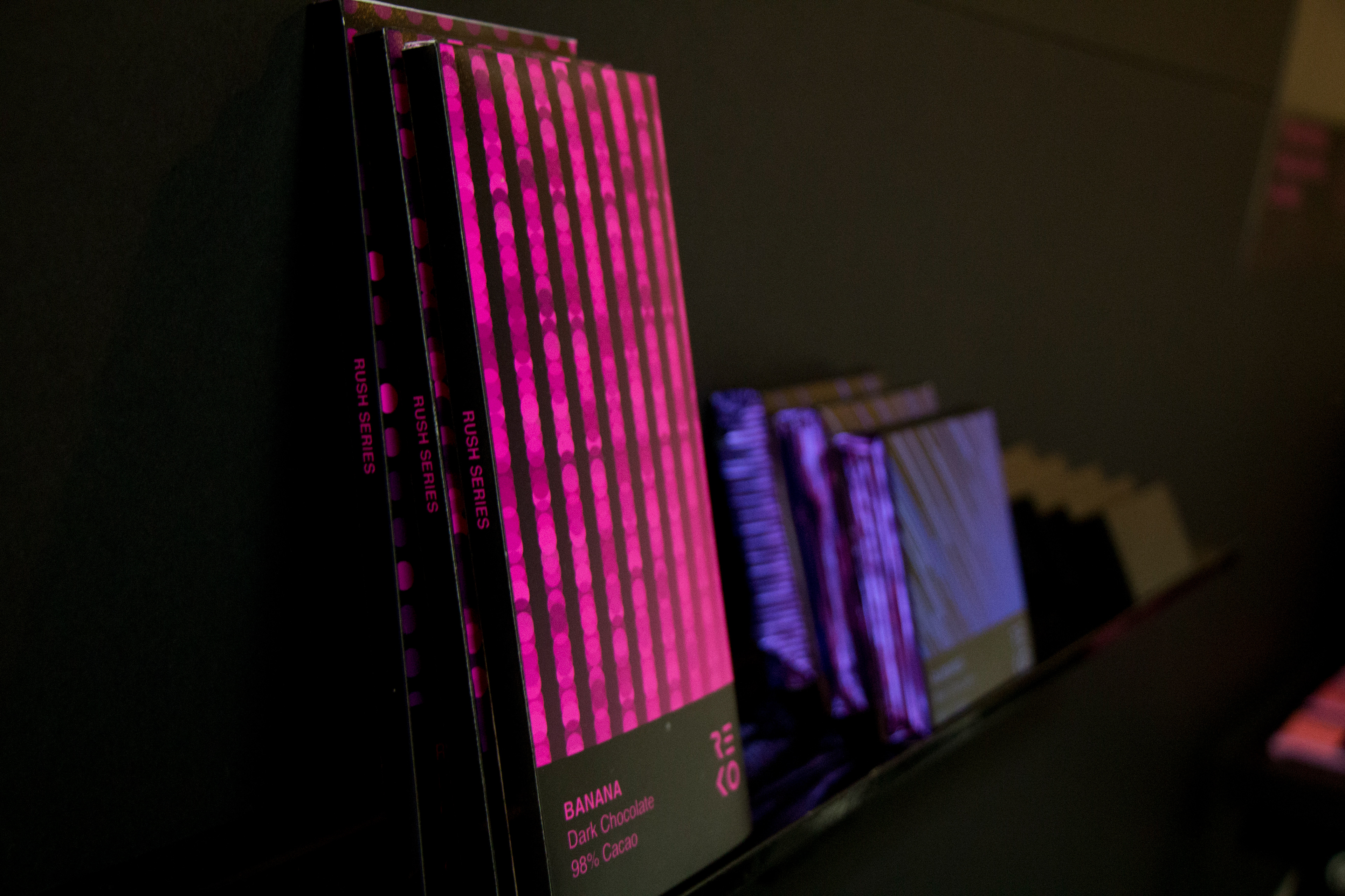
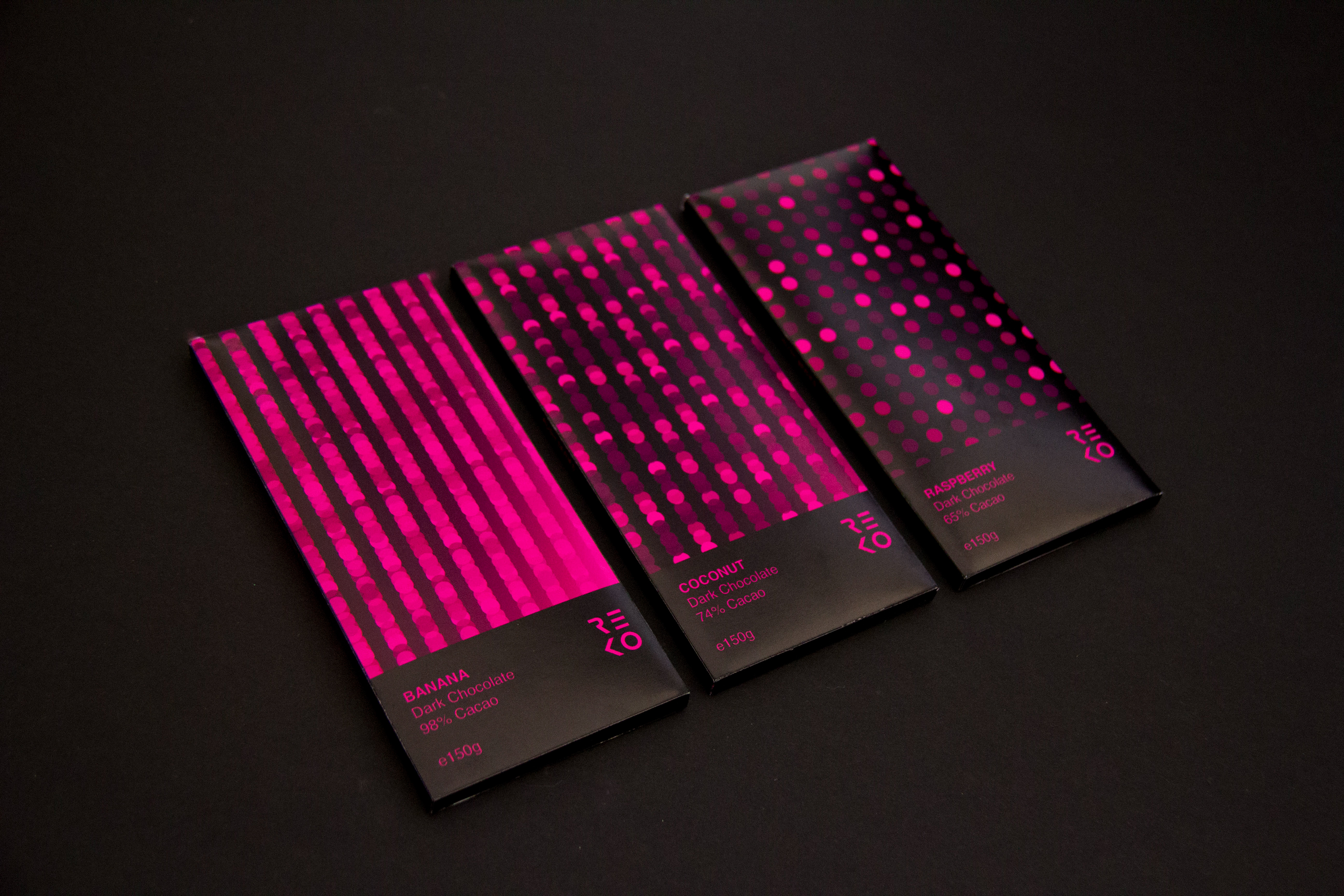
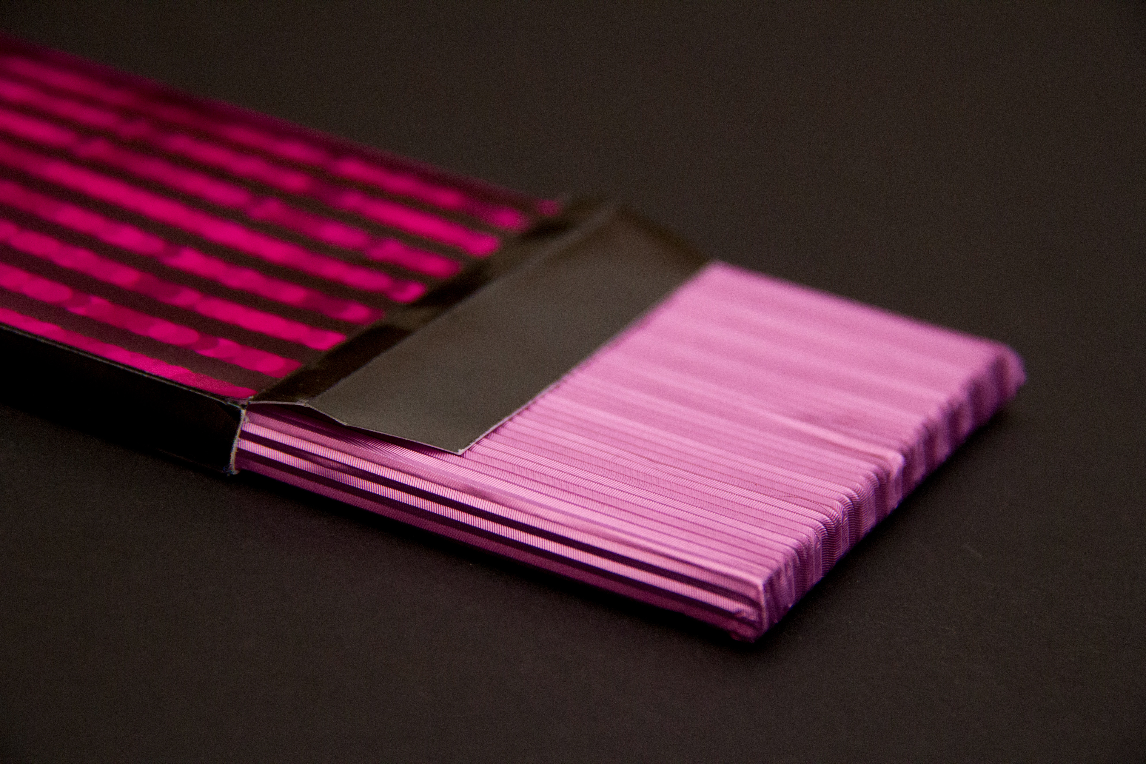
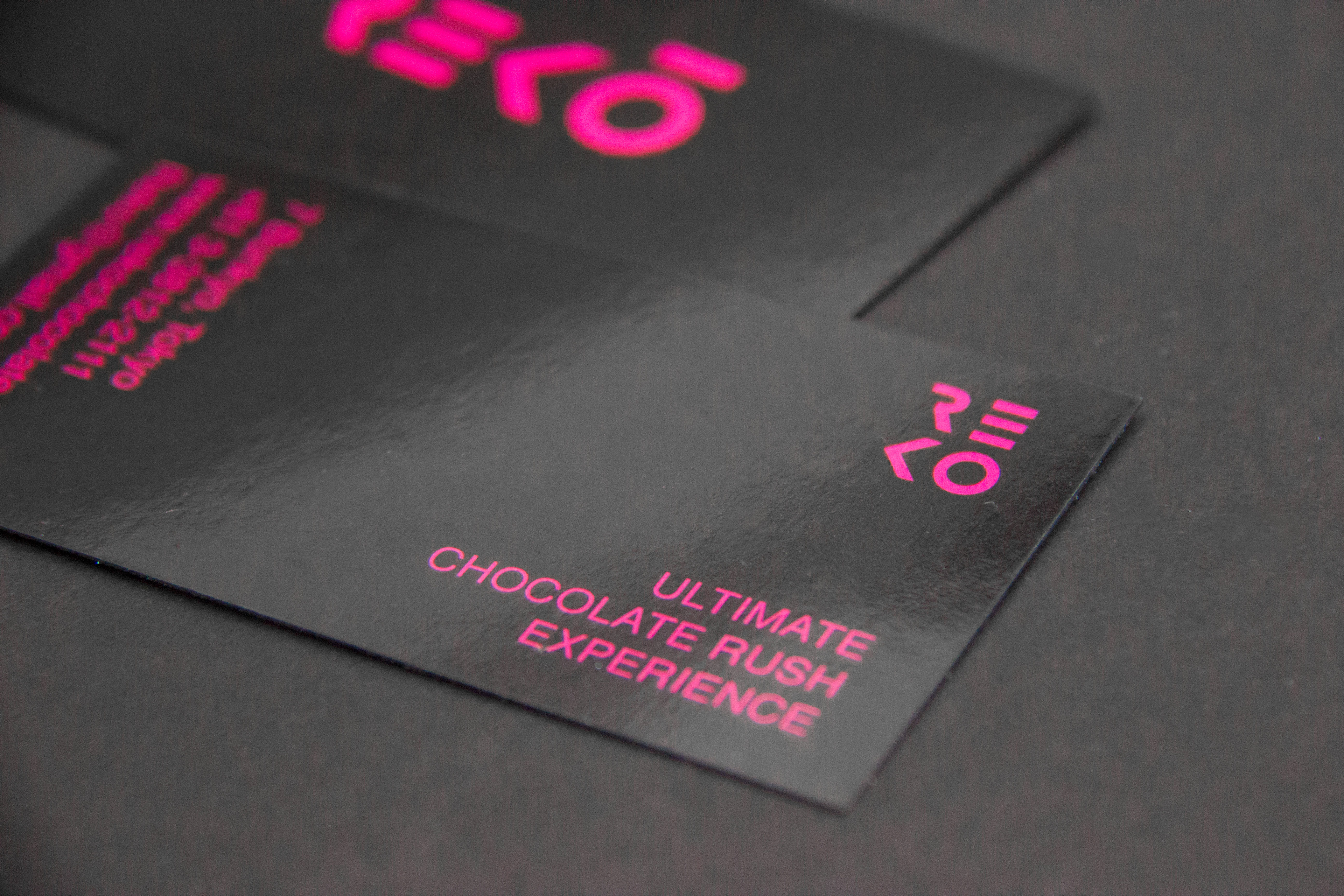
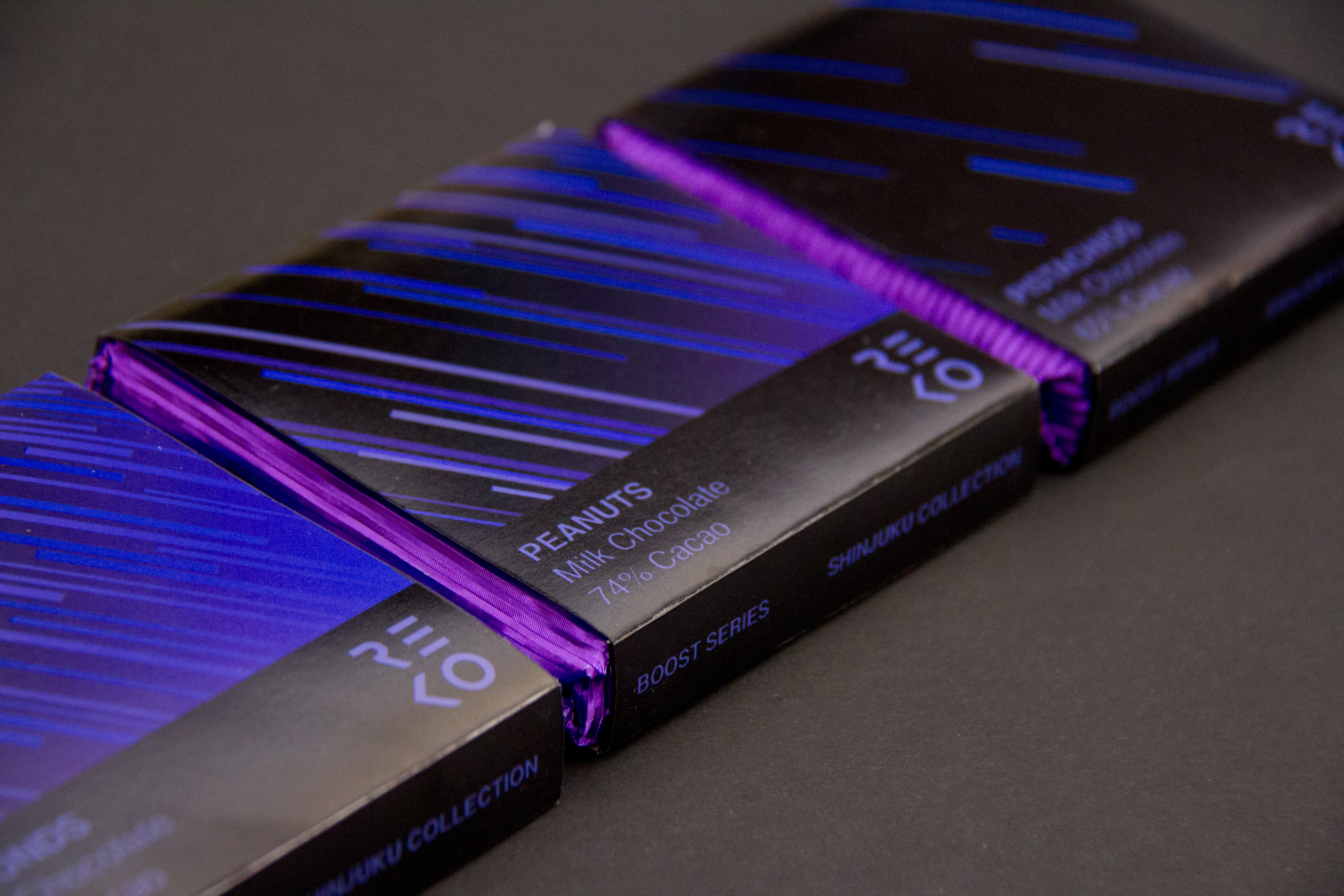
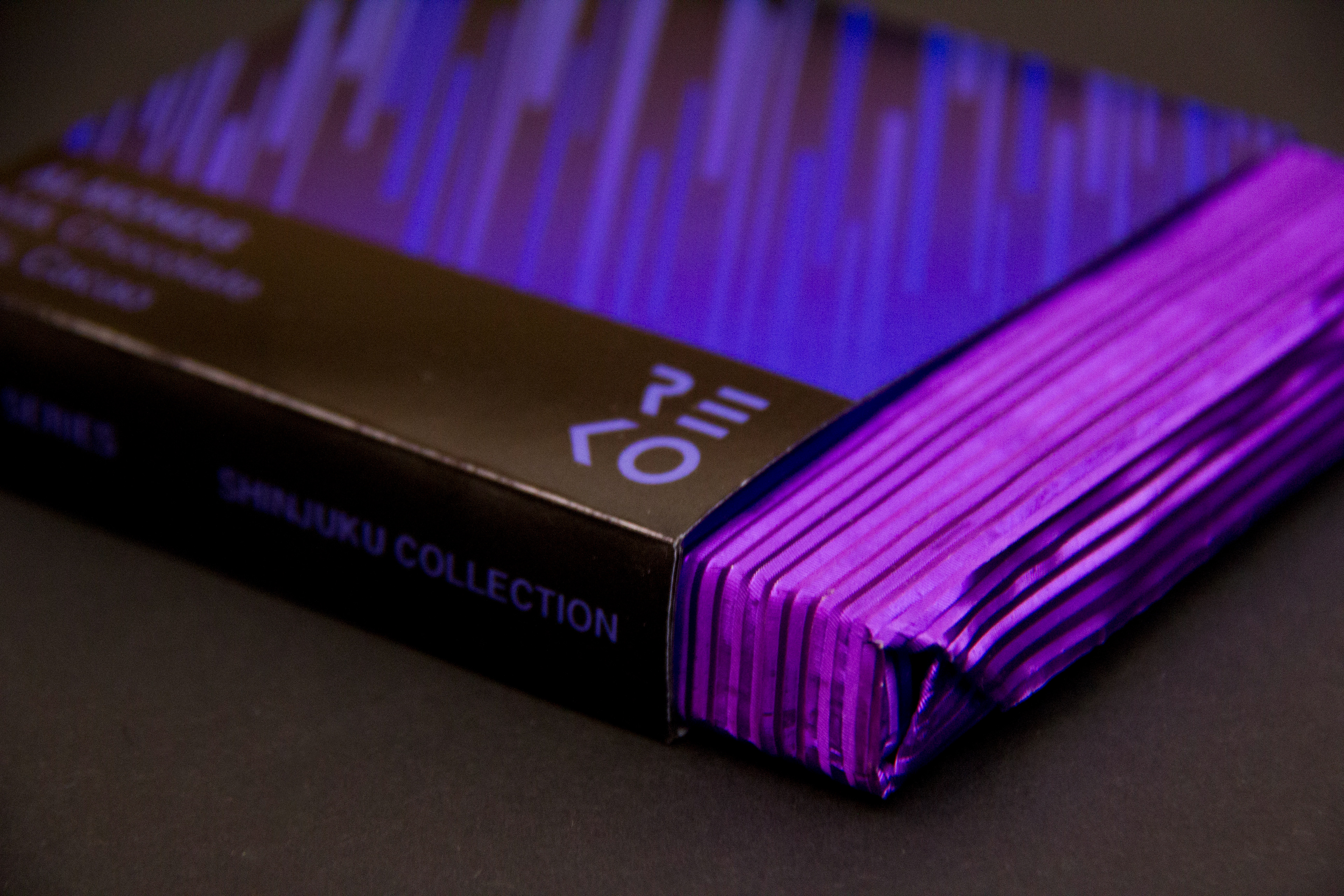
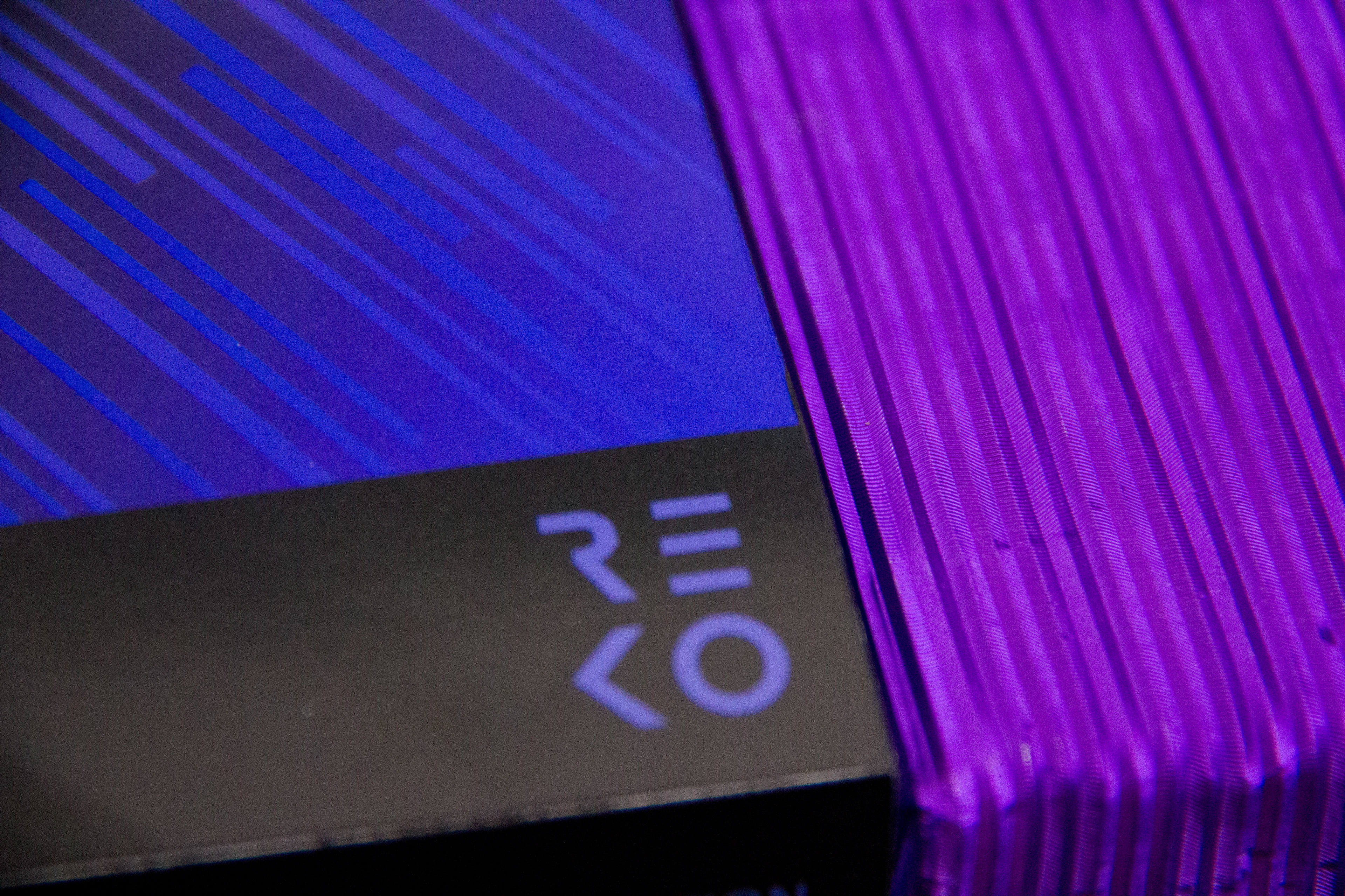
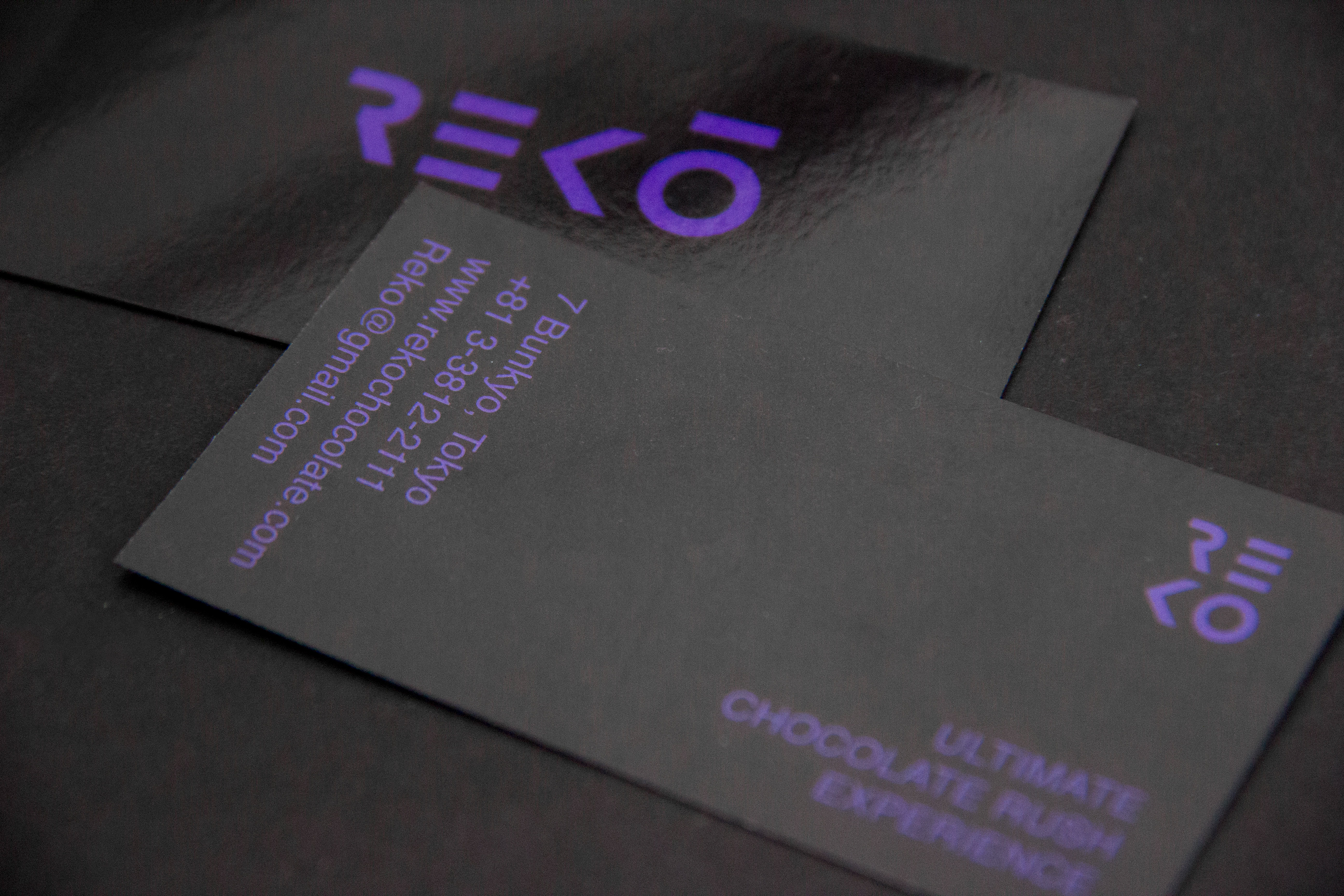
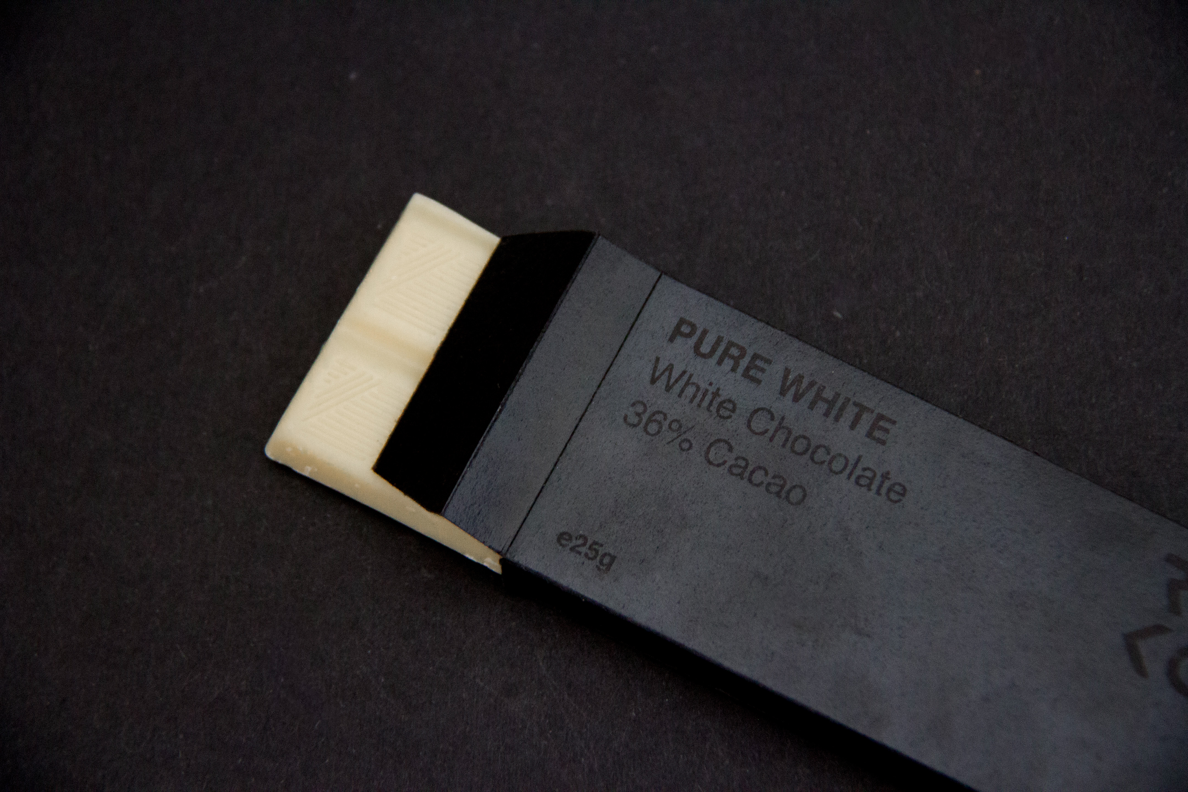
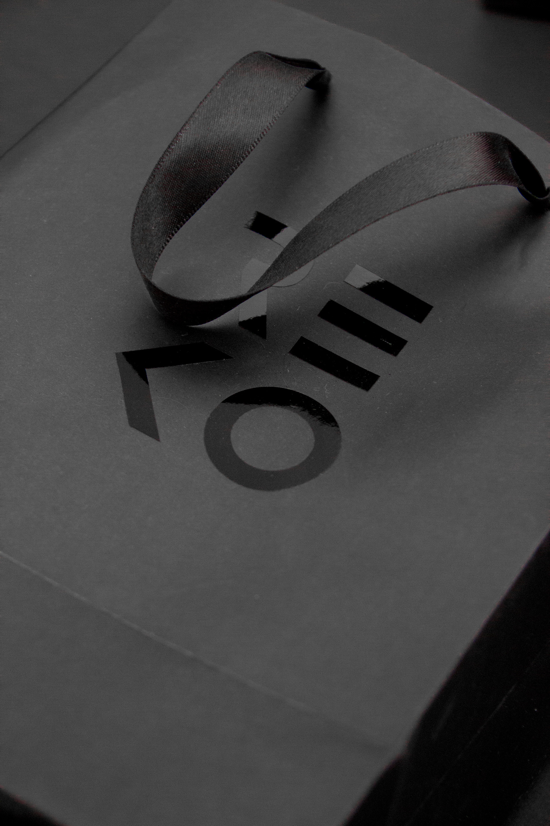
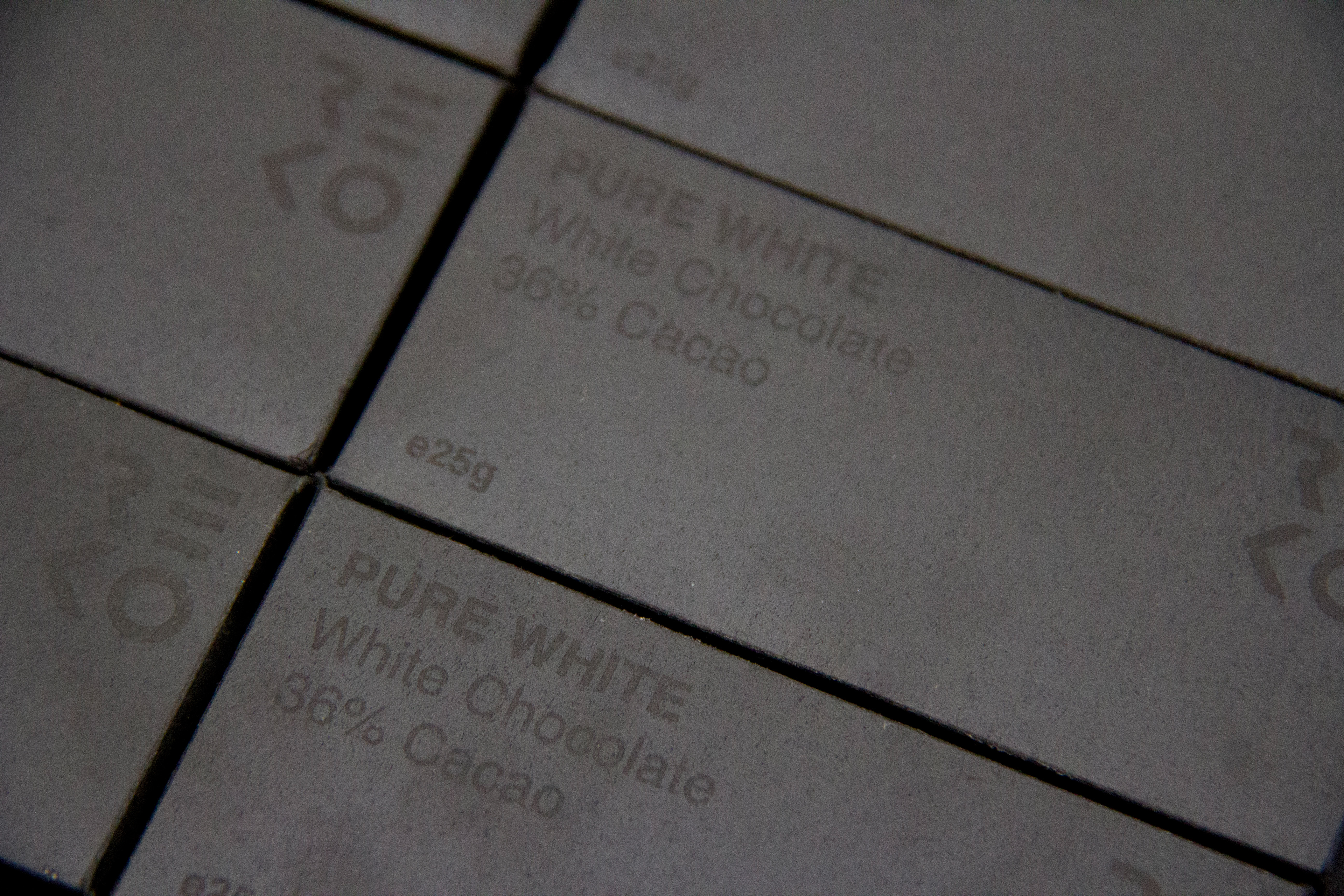
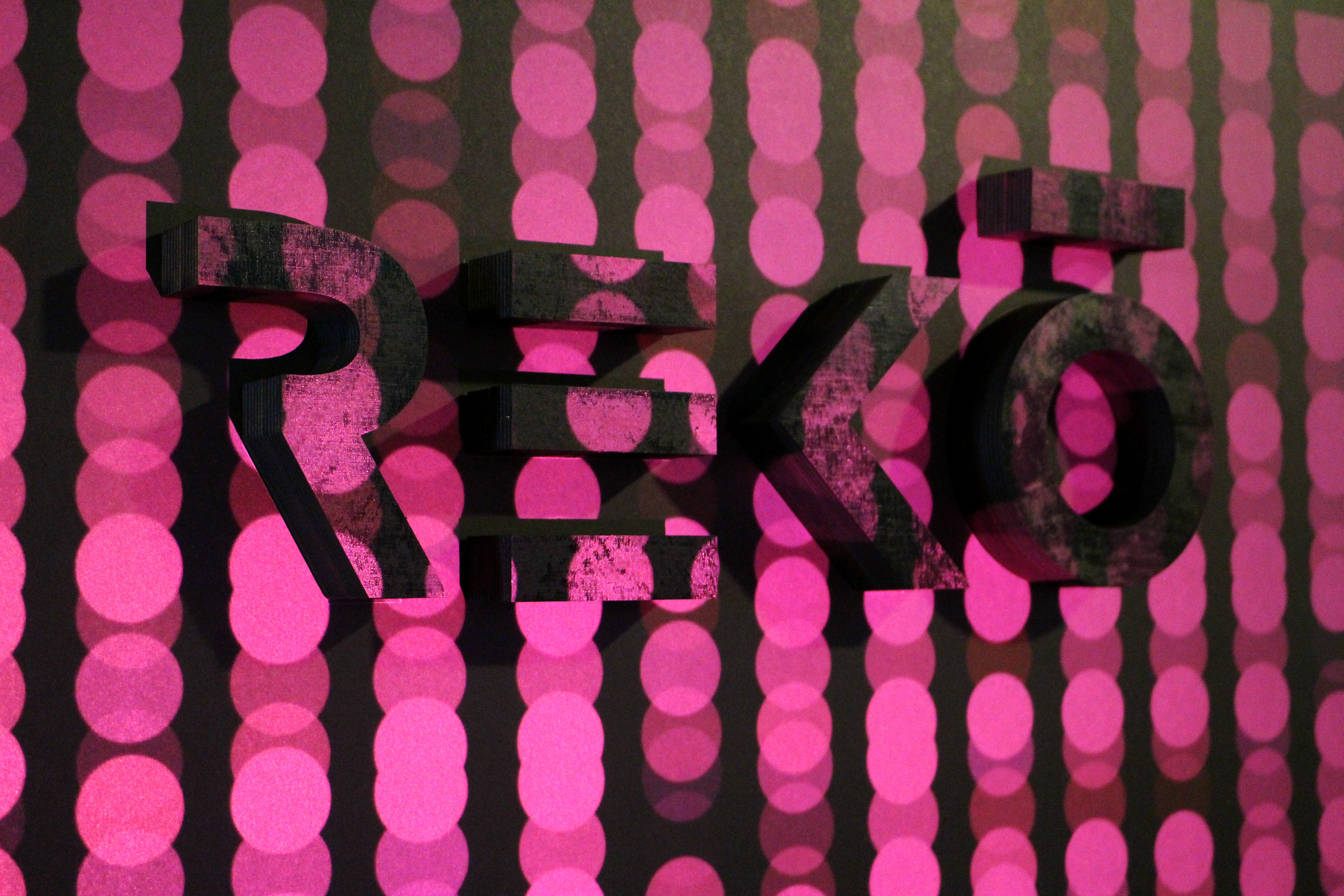
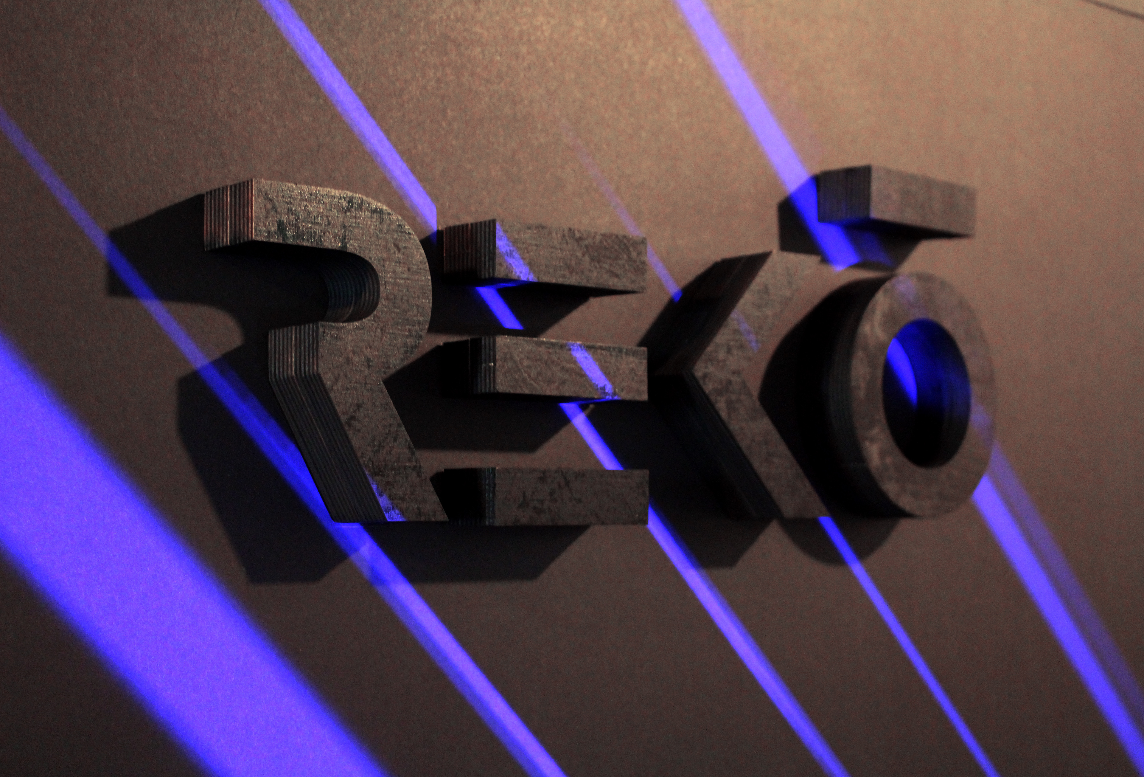
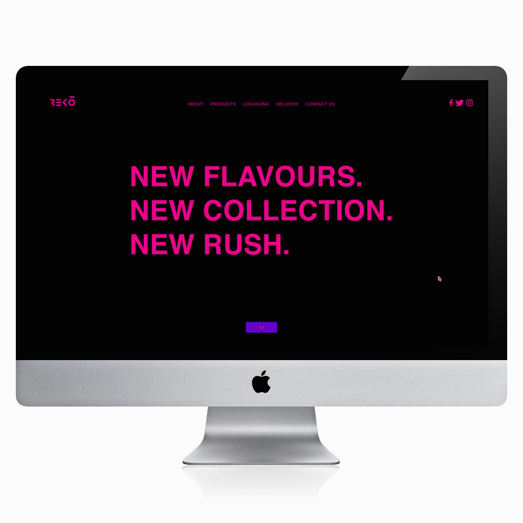
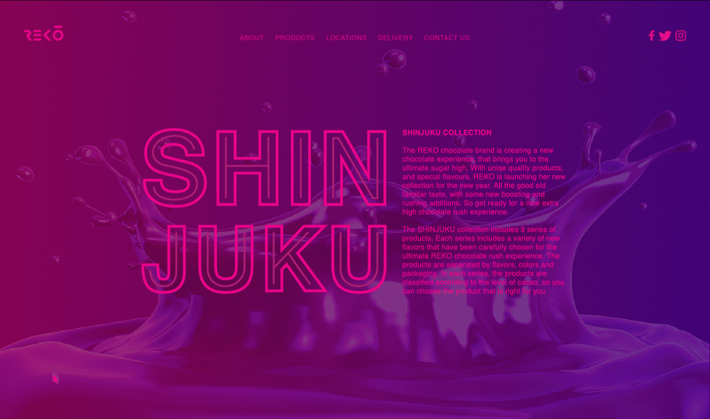
REKO chocolate branding
Branding for a chocolate shop. The concept is based on the fact that in the second one who eats a chocolate cube, the body wakes up, the senses become sharper and there is a feeling of sugar rush throughout your body.
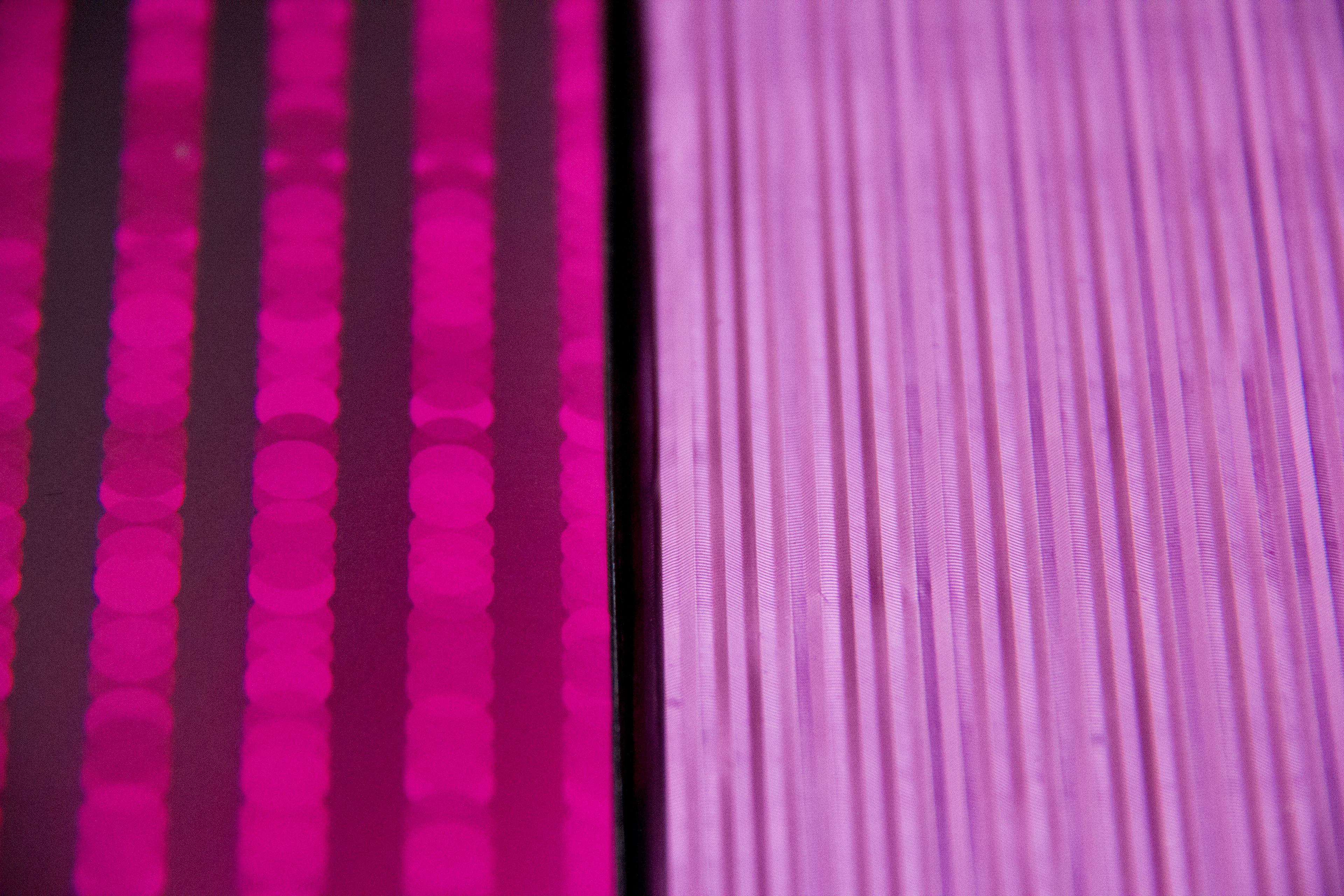
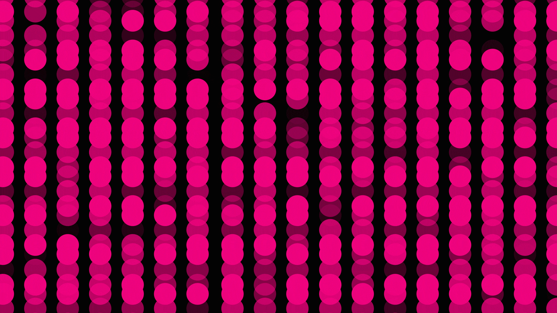
From this concept, the design was influenced by the visual world of Tokyo streets at night. The flickering signs and the neon colors, and in the same breath, restraint and precision that are characteristic of Japan itself. Created on my third year at Shenkar College as part of the Branding course.